Erae Lab Style Tab: Color, Light & Degree
The Style tab in Erae Lab's right panel controls how elements look on your Erae: their color, fill style, brightness response, and the animation that plays when you touch them. For keyboard elements (Isomorphic, Chromatic, Drumpad) you can also color individual scale degrees differently, so your layout gives you instant visual orientation while playing.
This feature works identically on Erae Touch and Erae 2.
Note: Changes you make in the Style tab update the Lab canvas immediately. Your Erae only receives the new look when you push or sync your project to the device.
Opening the Style Tab
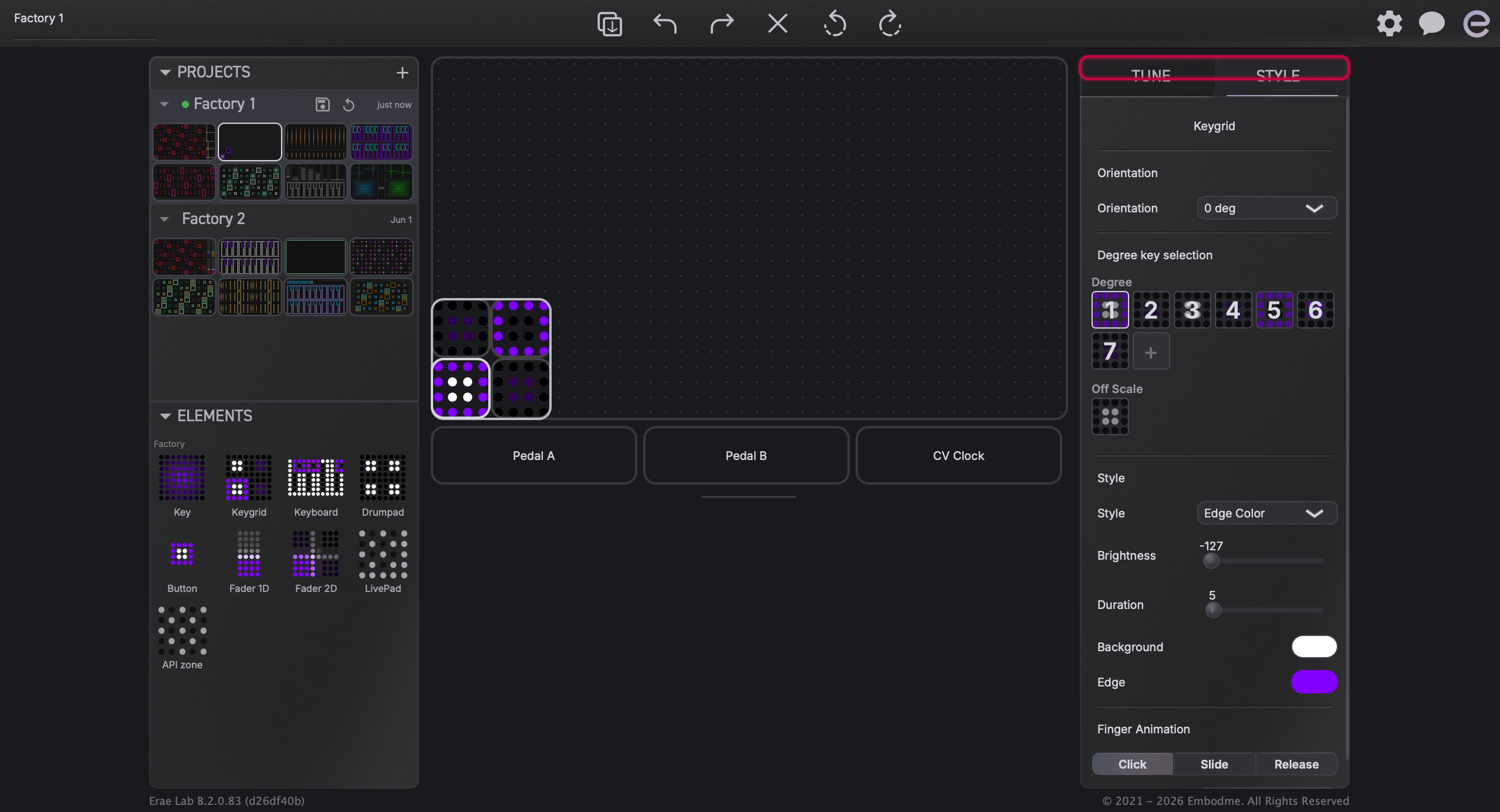
Click any element on the canvas to select it. The right panel shows two tabs, TUNE and STYLE, at the top. Click STYLE to see the color and animation controls for that element.
Placing and Resizing Elements
Before you can style an element, you need to place it on the canvas. Drag any element type from the Elements section of the left sidebar onto the canvas. To resize it, drag any edge of the element. You can hold Shift while resizing to keep the element's proportions locked.

Color and Fill Style
Choosing a Fill Style
The top of the Style panel has a Style dropdown that sets how color fills the element. The options available depend on the element type:
| Fill style | What it does |
|---|---|
| Solid Color | One flat color across the whole element |
| Linear Gradient | Two colors blending in a straight line; you set the angle |
| Circular Gradient | Two colors blending from center outward |
| Rectangular Gradient | Two colors blending from center to edges, rectangular shape |
| Edge Color | A narrow lit edge with a separate background color |
Buttons have a few additional modes: Dual Intensity (one color, dimmer when off), Dual Color (separate on/off colors), and Center Fill (edge color with a center fill). Faders use their own dedicated color settings (bar color, edge color, background color).

Picking Colors
Click any color swatch in the Style panel to open the color picker. The picker shows a hue ring around the outside and a triangular saturation/brightness selector inside: drag within the triangle to adjust the color, and drag around the ring to shift the hue. You can also type a hex value directly.
To save a color for reuse, look for the + button beside the swatches in the left sidebar's Colors section. Saved colors appear there as quick-pick swatches.

Brightness and Duration
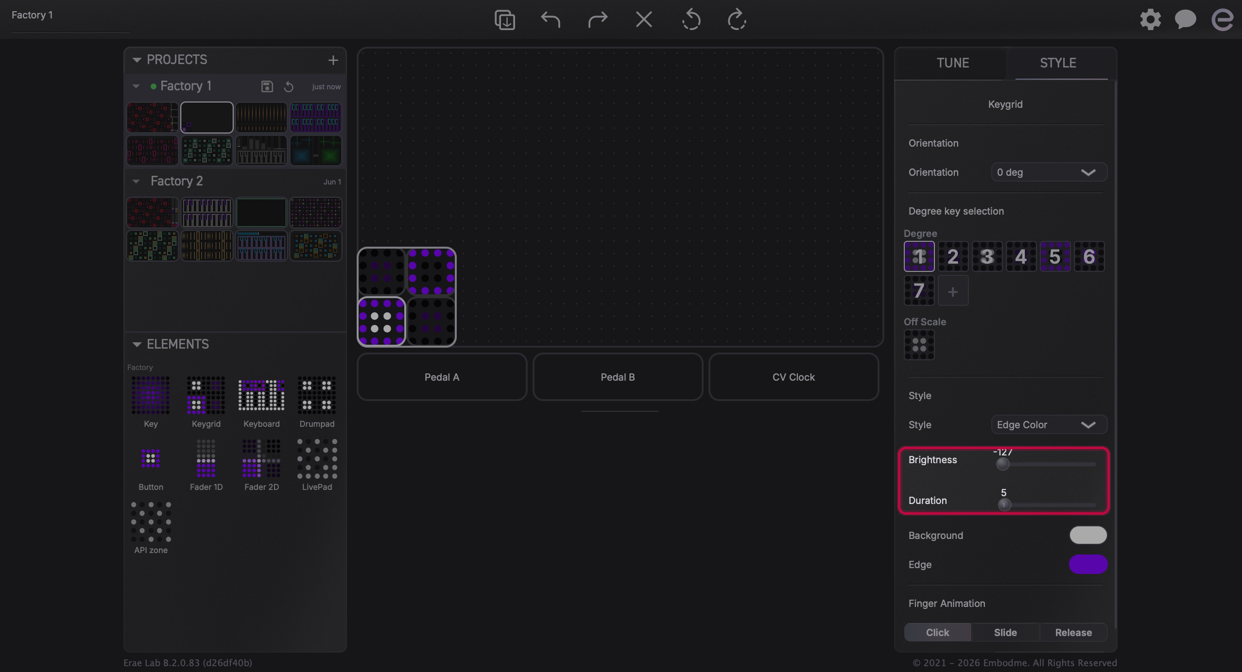
Below the color controls, two sliders let you add a brightness flash on touch:
- Brightness: how much brighter (positive) or darker (negative) the element flashes when you press it. A value of 0 means no brightness change.
- Duration: how long the flash lasts after you lift your finger (0 = very brief, higher = lingers longer).
Together these create a visual "pulse" that confirms your touch. These controls apply on top of the element's base color: they don't change the color itself, only the intensity.
Degree Coloring (Keyboard Elements Only)
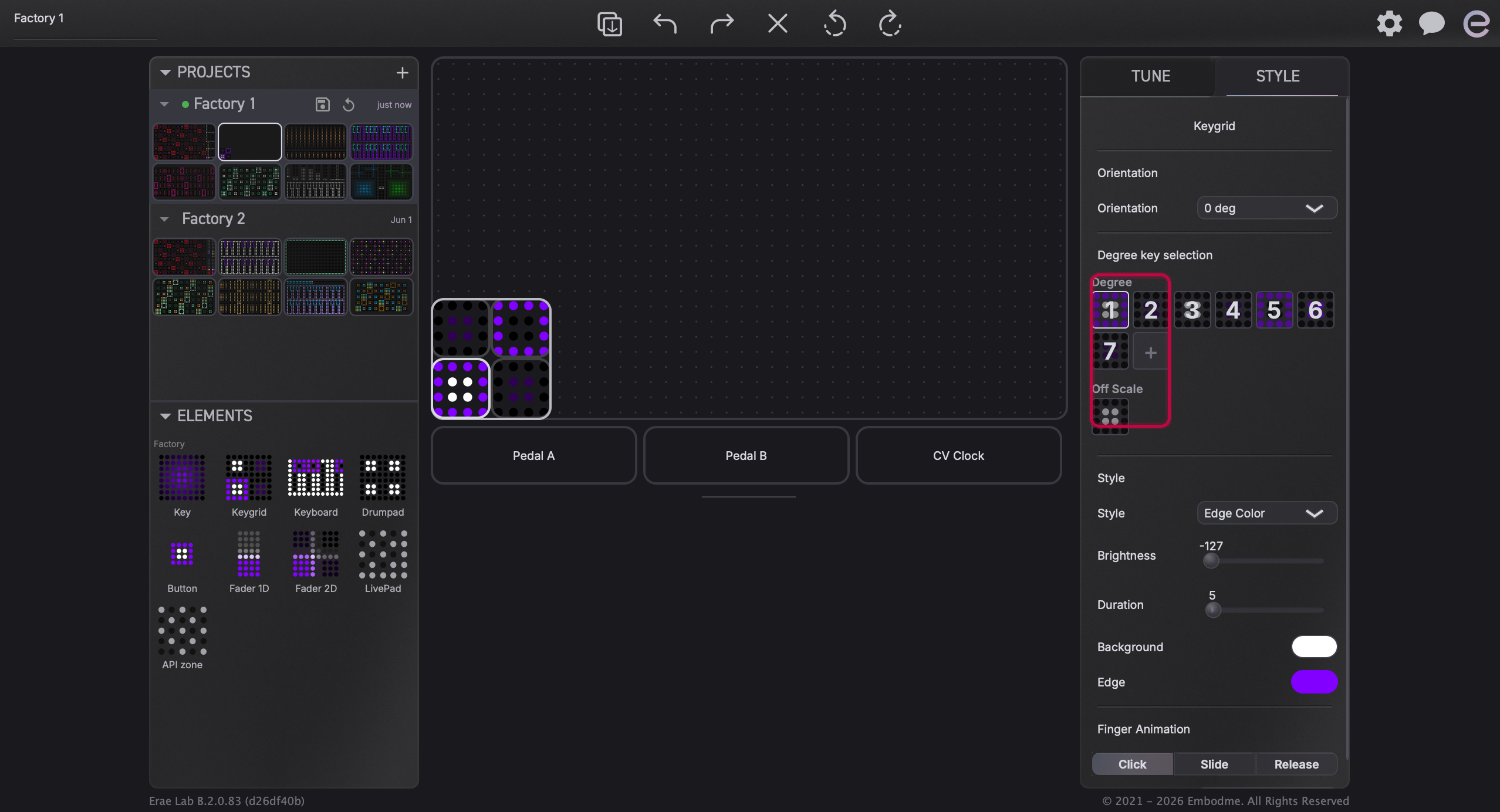
When you select an Isomorphic, Chromatic, or Drumpad element, the Style tab shows a Degrees section. This lets you assign a different color to each scale degree, so you can tell at a glance where root notes, thirds, or fifths fall in your layout.
The degree buttons are numbered (1, 2, 3, and so on) for each scale degree, plus a separate Off Scale button for notes that fall outside the active scale.
Selecting Degrees to Color
- Click a degree button to select only that degree.
- Cmd-click (macOS) or Ctrl-click (Windows) to add individual degrees to your selection without deselecting others.
- Shift-click to select a range of degrees between your previous click and this one.
- Double-click any degree to select all degrees at once.
Once you have one or more degrees selected, the color picker above applies only to those degrees. You can give each degree its own hue to build a fully color-coded layout.
The Off Scale entry controls the color of any note outside the current scale (notes that exist on the hardware surface but don't belong to the active key/mode). Setting it to a dim or neutral color helps you stay in-scale while playing.
Note: The Degrees section only appears for Isomorphic, Chromatic, and Drumpad keyboard elements. Keys, Faders, and Buttons do not have per-degree coloring because they represent single notes or control signals, not scale grids.
Finger Animation
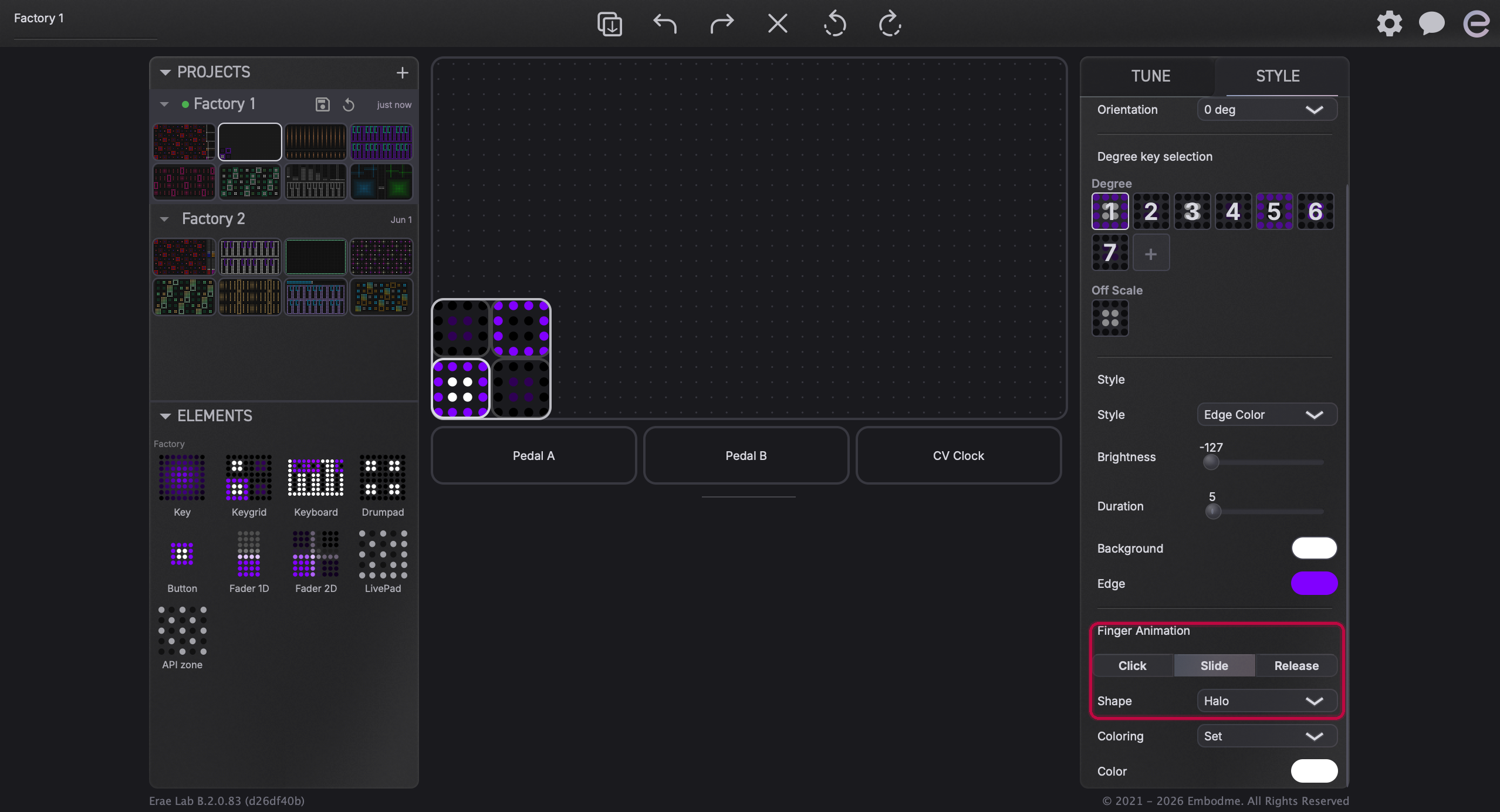
The Animation section controls the visual effect that plays when you touch, slide, or release the element. There are three tabs, Click, Slide, and Release, each configurable independently.
Available Shapes
The shapes available differ per interaction type:
| Tab | Available shapes |
|---|---|
| Click | Glow, Ripple, Color Morph, Disable |
| Slide | Glow, Halo, Color Morph, Disable |
| Release | Glow, Ripple, Color Morph, Disable |
- Glow: a soft expanding circle that pulses outward from the touch point.
- Ripple: a wave ring that spreads out from the touch point (available on Click and Release only).
- Halo: a diffuse glow ring that follows your finger as you slide (available on Slide only).
- Color Morph: transitions the element's color as you touch, slide, or release it, instead of layering a separate glow or ring on top (available on all three tabs).
- Disable: turns off the animation for that interaction.
Note: Halo is only an option on the Slide tab. Ripple is only available on Click and Release. Glow and Color Morph are available on all three tabs. This is by design: each shape is matched to the movement it best represents.
Animation Color
Each animation tab also has a Coloring option:
- From Element: the animation inherits the color of the element underneath.
- Set: you pick a specific animation color using its own color picker.
When Halo is selected on the Slide tab, the coloring defaults to Set automatically (the halo always uses a dedicated color).
Amount and Speed
- Amount: controls how strong or intense the animation effect appears (0-100).
- Speed: how fast the animation plays out.


Applying Style to Multiple Elements at Once
You can select multiple elements by holding Cmd (macOS) or Ctrl (Windows) and clicking each one, or by clicking and dragging a selection box across the canvas. When multiple elements are selected, the right panel switches to a multi-select view. The Style tab still appears and any color or animation changes you make apply to all selected elements simultaneously.
Syncing to Your Erae
Style changes are stored in your project file in Erae Lab. To see them on your Erae, save and push the project to the device. The canvas preview updates immediately as you adjust settings, and the device reflects the changes after the next sync.
For more on saving and syncing your project, see Erae Lab Overview.